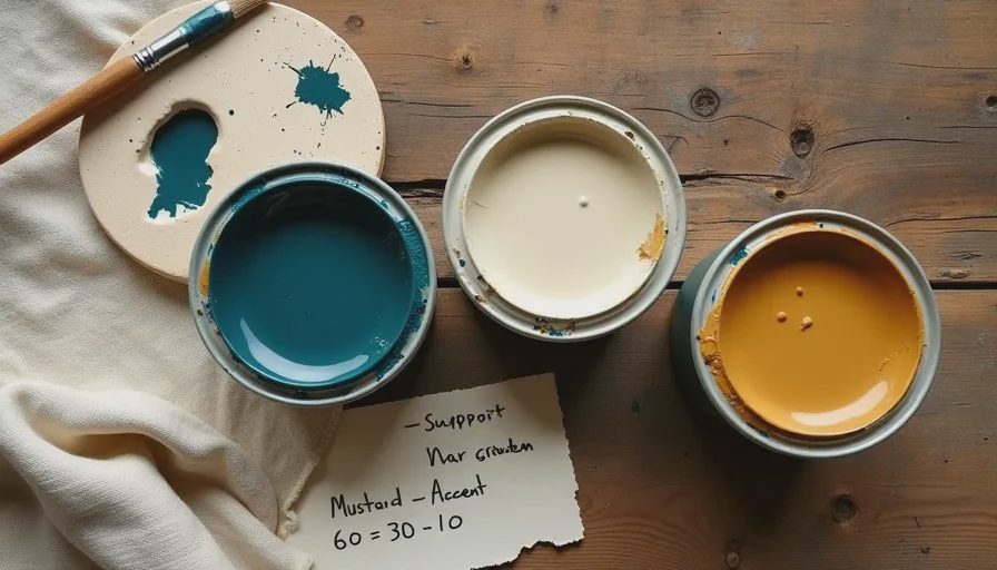
If picking paint colors makes you want to lie face-down on the floor and give up, I have something that might help. It's not another "greige is timeless" lecture from someone whose home has never seen a toddler with a marker. It's a paint color guide for rooms that I lifted directly from my RISD oil painting classes — specifically from a professor who said, "If you can't make a painting work with three colors, adding twelve more won't save you." That same logic applies to your living room. I call it the primary-support-accent rule, and once you understand it, you'll stop impulse-buying that clearance-rack pouf because you'll finally know why it doesn't belong in your space.
Where This Rule Comes From
In oil painting, you learn early that an entire composition can hold together with just three tubes: a dominant pigment, white for mixing, and a contrasting accent for tension. The old masters didn't need fifty colors — they needed discipline. I apply that exact thinking to every room I decorate. Instead of paint tubes, the elements are walls, large furniture, and small accessories. Pick one dominant color that anchors the room, one supporting neutral that carries the weight without competing, and one small accent that makes the whole thing feel intentional. That's it. No color wheel panic, no "what if I get tired of it" paralysis.
Breaking Down the Three Roles
Primary: The Anchor
Your primary color is the biggest commitment. In my Fort Greene living room, the primary is a deep, dusty blue-green on the walls. In a rental where you can't paint, your primary could be a large sofa or an area rug — something that takes up significant visual real estate. The primary sets the emotional tone of the room, so pick something you can live with in all lights. I test a sample on poster board and move it around the room for three days. Morning light, afternoon light, lamp light. If I still like it on Thursday, it stays. If it makes my skin look ill at breakfast, it's out.
Support: The Quiet Workhorse
Support colors don't get enough credit. My support is a warm cream — it appears on the sofa upholstery, the linen curtains, and the large jute rug. It lets the blue-green walls be the star without fading into landlord white. A good support color bridges the primary and the accent so nothing looks random. Think of it as the bass player in a band: you might not notice it first, but you'd absolutely notice if it disappeared and all that was left was noise.
Accent: The Surprise
My accent is mustard yellow. It shows up on exactly two velvet cushions, a thrifted ceramic table lamp, and a small bowl that holds our keys by the door. That tiny pop — maybe 10% of the room's visual space — makes the whole thing feel deliberate. The accent is where you get to be playful. If you tire of it in two years, swapping out two cushions costs forty dollars. Repainting an entire room because you went too bold on the walls? That's a weekend you'll never get back.

The 60-30-10 Proportion That Keeps You Honest
I don't treat this as a law, but as a guardrail. Roughly 60% of the room's color should come from the primary, 30% from the support, and 10% from the accent. When I measure my living room against this, it checks out: the blue-green walls dominate, the cream sofa and rug fill in the middle, and the mustard accents are just enough to surprise you without screaming. If you're unsure, take a photo of your room on your phone and squint at it. The color distribution should feel balanced, not like one thing is fighting for attention.
What Happens When You Ignore the Rule
I broke my own system exactly once, and I still cringe thinking about it. Our hallway, which is narrow and windowless, needed some life. Instead of following the rule, I decided chartreuse — a loud, acidic yellow-green — would be my "fun pop." But I gave it too much space: a chartreuse runner, a chartreuse-framed mirror, and a small chartreuse side table that I'd found at a stoop sale for twelve dollars. Within a week, I felt like I was walking through the inside of a lime every time I went to the bathroom. I'd given an accent color the square footage of a primary. I returned the runner to the flea market, kept the mirror frame because it was genuinely beautiful at that scale, and suddenly the hallway could breathe again. The lesson: accent means small, not "I found a deal and got carried away."

How to Start with What You Already Own
You don't need to buy new things to build a color palette from one thing. Pull out a favorite cushion, a piece of pottery, or even a book cover you love. Extract three colors from that single object — one dominant, one supporting, one accent — and those become your room's palette. My current scheme started with a vintage quilt I found at the Brooklyn Flea three years ago. It had deep teal stitching, a soft cream background, and tiny mustard-yellow flowers embroidered along the edge. I pulled those three colors and built the entire room around them. The quilt now lives on the back of the sofa, and the room still makes sense because everything traces back to that one source.
Why This Beats the Beige Default
Most people default to beige out of fear. Fear of getting it wrong, fear of resale value, fear that a real color will feel "too much." But beige isn't a personality — it's a concession. When you trust a three-color structure, you can pick hues that actually feel like you and still end up with a room that hangs together. That's honest home design advice that doesn't require a designer, a $40 paint consultation, or an afternoon of arguing with your partner at the hardware store. It's just an artist's trick that's been working for centuries. Try it on one room. If you hate the result, the only thing you're out is a sample pot and a weekend. But if it works, you'll never look at a paint chip display the same way again.



Letters
No letters yet — be the first to write.