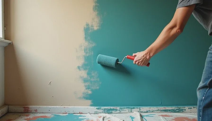
Let me be clear about something right at the top: I don't hate pumpkin spice lattes. I have consumed them. I will probably consume them again. But the pumpkin spice latte is not a personality. It's a seasonal default — something you order when you don't feel like making a real decision, when you want something warm and familiar that won't surprise you. Beige walls are exactly the same thing. They're the "I'll just have a PSL" of home decor. Safe, ubiquitous, faintly sweet, and a complete abdication of having an opinion about your own space. This isn't just honest home design advice — it's an intervention. Your walls are apologizing for existing, and you deserve better.
How We All Got Beige-Pilled
The beige industrial complex has been running one of the most successful marketing campaigns in modern history. For decades, we've been told that beige is "timeless," "versatile," "a blank canvas." Landlords paint every rental unit in variations of it because it's the cheapest gallon at the hardware store and it hides drywall flaws in low light. Real estate agents recommend it because they want potential buyers to "imagine themselves in the space" — which is code for "we don't want the walls to have any trace of the people who actually lived here." Somewhere along the way, we internalized this logic. We started believing that the safest choice was the smartest choice, that a wall with color was a liability, that resale value should dictate the shade of the room where we drink our morning coffee.
But here's what nobody tells you about beige: it shows everything. Every scuff, every fingerprint, every patch of sunlight fading. A beige wall doesn't stay beige — it becomes a patchwork of greasy handprints at light-switch height, a gradient of yellowing where the sun hits, a ghost of every piece of furniture that once leaned against it. When Felix was three, he drew a red crayon mural on our then-beige hallway wall, and I realized — while scrubbing it at 6 a.m. — that I was more annoyed at the wall than the crayon. The wall had no personality to defend. The crayon was an improvement.
The Fear That Keeps Us Beige
Most people don't choose beige because they love it. They choose it because they're afraid. Afraid of getting it wrong. Afraid that a color they pick today will feel dated in three years. Afraid that guests will walk in and silently judge their taste. Afraid that a bold wall will make the room feel smaller. These fears are real, but they're also solvable. Let's address them one at a time.
"What if I get tired of it?"
You might. And then you paint over it. Paint costs about $40 to $70 a gallon, and a gallon covers a standard room. That's less than a dinner out in New York. If you pick a color you genuinely love right now, and you live with it happily for four years before wanting a change, you've spent about $15 a year on enjoying your own walls. That's not a mistake. That's a subscription to your own happiness.
"What if it makes the room feel small?"
This is the most persistent myth in paint color guide for rooms advice, and it needs to die. Dark colors don't make rooms feel small — bad lighting makes rooms feel small. A deep color in a room with good natural light creates depth, not claustrophobia. My living room is painted a dusty blue-green that's several shades darker than any beige, and not one person has ever walked in and said, "Wow, this feels cramped." They say, "This feels like you." That's the whole point.
"What about resale value?"
Unless you're listing your apartment next month, you are living in your home right now. You're not a caretaker for the next owner's taste. Besides, a well-chosen wall color in a room that's clearly loved and lived-in photographs beautifully. I've seen beige boxes sit on the market for months while apartments with personality sell in days. Buyers aren't robots. They respond to homes that feel like someone was happy there.
My Own Beige Period
I am not immune to bad decisions. When we moved into this Fort Greene apartment four years ago, I panicked. The light was different from our last place, the rooms were shaped differently, and I had two four-year-olds and a deadline for a book illustration due that same month. So I defaulted. I bought five gallons of a shade called "Natural Linen" — which is a poetic way of saying "the inside of a bandage" — and painted the entire living room and hallway. It took a full weekend. By Tuesday, I hated it. By Thursday, Marcus told me it looked like we were still waiting for the movers to show up. I lasted four months in that beige box before I cracked open a can of deep teal and never looked back.
The day I started painting over it, Felix and Cleo sat on the floor watching me. Cleo asked why I was painting over the "boring color." Felix asked if the new color would be less boring. When eight-year-olds are critiquing your wall color, it's time to admit you've made a mistake.

What to Paint Instead: A Starting Point
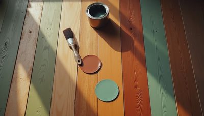
If you've been living in beige and you're ready to escape, but you don't know where to start, here's my advice. Don't go to the paint store and stare at a wall of three thousand chips. That's how you end up overwhelmed and buying another gallon of beige. Instead, do this: build a color palette from one thing you already own and love. A cushion. A ceramic bowl. The spine of a favorite book. A vintage scarf. Pull three colors from that object — one dominant, one supporting, one accent — and let the dominant one become your wall color.
For me, it was a vintage quilt from the Brooklyn Flea. Deep teal stitching, soft cream background, tiny mustard flowers. Those three colors became my living room. The walls are the teal. The sofa is the cream. The cushions and lamp are the mustard. The room hangs together effortlessly because every color traces back to one object with meaning. Beige has no meaning. It's the absence of meaning.
A Room That Ages Gracefully
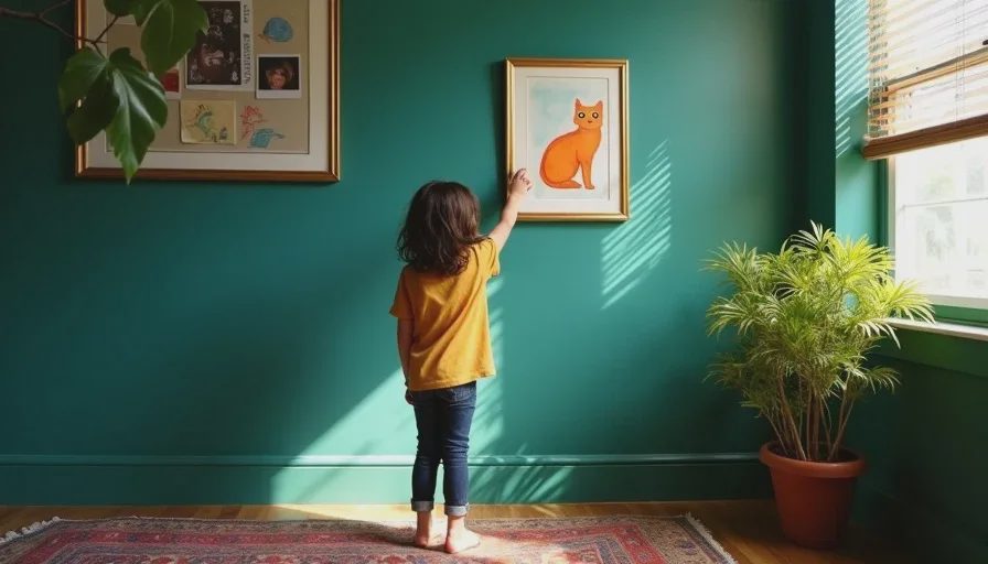
Here's what nobody tells you about colored walls: they get better with time. Sunlight fades them slightly in spots. Kids tape drawings to them. Furniture leans against them and leaves tiny marks. Nail holes accumulate where art gets rearranged. And all of that — all of it — looks better on a color than on beige. On beige, wear and tear looks like damage. On a deep teal or a warm ochre or a dusty rose, wear and tear looks like a life being lived. It's the difference between a scratch on a plastic cup and a scratch on a leather bag. One looks ruined. The other looks like it has a story.
The PSL Test
If you're still on the fence, I offer you this completely unscientific but surprisingly effective diagnostic tool. Next time you walk into your living room, ask yourself: if this room were a beverage, what would it be? If the answer is "a pumpkin spice latte" — warm, fine, a little basic, something you'd never brag about ordering — it might be time to try a different drink. Your walls are not a rental car. They're not a hotel lobby. They're the backdrop for every morning you'll spend with your coffee, every evening you'll spend with your people, every rainy Saturday you'll spend building forts with your kids. Don't make that backdrop beige just because someone told you it was safe. Safe is overrated. Taste is free. Everything else, we thrift — including the courage to paint your walls a color you actually love.

Letters
No letters yet — be the first to write.