Banner letters are one of those decorating ideas that can go charmingly personal or straight into birthday-party aisle territory. I have made both mistakes. In our Fort Greene apartment, the right set brought warmth to a blank hallway for $18. The wrong set made the dining room look like it was waiting for a toddler's cake. The difference is scale, material, spacing, and whether the words mean anything in your actual home.
I like decor that earns its wall space. A name, a useful word, or a slightly ridiculous family phrase can do that. You do not need a $300 custom sign or a perfectly styled shelf. You need a good thrift-store hunt, a wall that can handle a little personality, and the discipline to stop before every surface starts talking.
Choose the material before the message
Start with the material, because it sets the mood faster than the word itself. Felt gives you a soft, casual look and works well in a nursery, reading corner, or children's room. Wood feels more substantial and usually lasts longer, especially if the pieces will be handled by small hands. Metal letters can look terrific in a kitchen or entryway, but thin painted metal often has sharp edges and scratches easily.
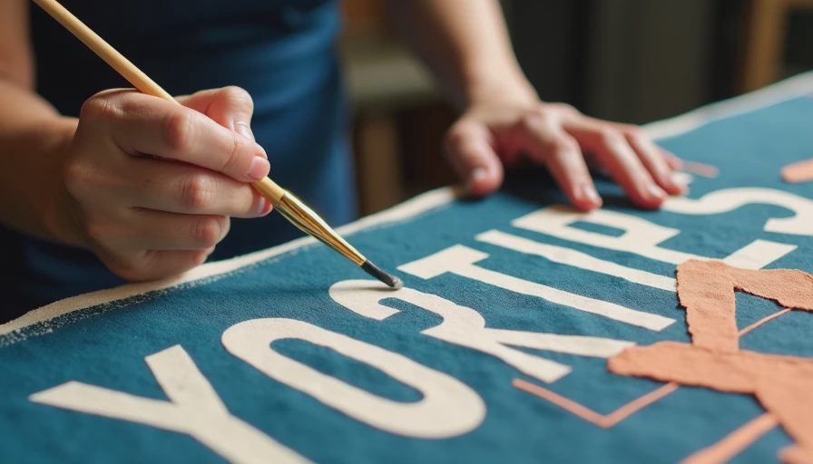
My favorite finds have been painted wood and old classroom-style cardboard letters. At the Brooklyn Flea, I once paid $2 each for mismatched blue and cream letters that spelled a short family nickname. The chipped edges were better than anything brand new. I cleaned them with a barely damp cloth, touched up only the worst scuffs, and left the remaining wear alone. Perfectly matching pieces can look manufactured; a little variation makes the arrangement feel like it belongs to you.
For banner letters, inspect the reverse side as carefully as the front. Look for old tape, rusty eyelets, bent tabs, and glue that has turned yellow. None of those problems automatically means no, but they should affect the price. A strand with six damaged pieces is not a bargain at $25. It is a repair project wearing a cute hat.

Pick a word that can survive your changing taste
Names are obvious, but they are not always the best choice. A child's name can feel sweet for years, while a seasonal phrase may have a much shorter life. I prefer words with a little elasticity: HOME, READ, PLAY, GATHER, or even a family nickname that visitors do not need explained.
Measure the wall before buying anything. This sounds painfully basic, but I once bought a beautiful set of banner letters for a narrow bookshelf and discovered that the full word extended nearly eight inches past the shelf on both sides. It looked less like intentional asymmetry and more like the word had fallen over. Write the word on scrap paper, mark each letter's width, and add at least an inch between pieces if they hang separately.
Short words are easier to style. Four to six letters can sit above a doorway, crib, bar cart, or desk without taking over. Longer words need either a wider wall or tighter spacing, and tight spacing is where the display starts looking like signage. If you want a sentimental phrase, break it across two lines or use only the strongest word.
Make thrifted pieces look deliberate
The cheapest way to make banner letters look expensive is to give them breathing room. Hang the strand lower than eye level in a child's room, but keep it well above grabbing distance if the hardware is loose. In an adult space, let the letters relate to nearby furniture. A word above a console should usually be narrower than the console, not wider. If it stretches beyond the furniture, the wall can feel top-heavy.
Choose one visual rule and stick with it. You can use mixed colors with matching material, or mixed materials in one restrained color. Doing both at once is how you get a display that resembles a craft bin after a small explosion. I like cream, faded red, tobacco brown, and dusty blue because they work with old wood and painted walls. Bright primary colors can work too, but then I keep the surrounding decor quiet.
Banner letters also look better when the hanging cord is visible. A thin cotton twine feels warmer than clear fishing line, which tends to make lightweight pieces look like they are floating in a party-supply catalog. For heavier wood, use braided cord or narrow leather, and test the knot before committing to the wall.
Hang them without damaging the wall
Renters, take heart: you do not need to drill six holes for one word. For lightweight felt or cardboard, removable adhesive hooks can work when the wall is clean and the package weight limit is respected. Place the hook on the cord rather than sticking adhesive directly to a painted letter. Direct contact can pull off a finish when you remove it.
For wood or metal, I prefer two attachment points instead of one center hook. The extra support keeps the strand from sagging and stops the word from rotating whenever someone closes a nearby door. Use a level, but do not let perfect geometry bully the room. A slight dip can look relaxed; an accidental tilt looks like you hung it during a phone call.
Before hanging, lay everything on the floor. Photograph the arrangement, measure the total width, and mark the wall with removable painter's tape. This takes five minutes and can save you from a row of unnecessary holes. If the pieces came with brittle old ribbon, replace it before hanging. It is irritating to find a letter on the floor at 2 a.m., and Gouache the cat considers fallen decor a personal invitation.
What I would buy, skip, and repair
I would buy a faded wooden set under $20, even if the colors are not perfect. A small can of sample paint, usually around $5 to $8, can unify mismatched pieces. Scuff the edges afterward with fine sandpaper so the repaint does not look freshly manufactured. I would also buy a clean felt strand for a nursery if the backing is sturdy and the letters are securely sewn.
I would skip anything with a strong basement smell, swollen particleboard, or peeling paint that creates dust. I would also skip oversized foam letters unless the room is deliberately playful. They are light, but their bulk can make a small apartment feel visually crowded. Banner letters should add a note, not deliver a speech.
The best repair is often simple: new cord, a gentle cleaning, and one restrained color adjustment. Do not repaint every flaw. Some wear is the entire reason the item is interesting. If a letter is missing, either change the word or embrace the odd arrangement. Buying three new pieces to force an old set into a perfect phrase is how a $12 find becomes a $47 project.
My honest rule for using them
Use banner letters where you want a little voice: over a reading chair, beside a child's art table, above a breakfast nook, or in an entryway that needs more than a mirror. Do not use them to fill an empty wall simply because the wall is empty. A blank wall may need a larger painting, a useful shelf, or absolutely nothing for a while.
When I style banner letters, I ask whether they connect to the people who live in the room. If the answer is yes, the display can be slightly crooked, thrifted, and imperfect. That is the point. Keep the word short, let the material show some history, and spend the saved money on the thing you will actually use. Taste is free. Everything else, we thrift.


Letters
No letters yet — be the first to write.