The most common question I get from readers isn't about furniture or flea markets. It's this: "How do I pick colors that go together?" Sometimes it's followed by "I've been staring at paint chips for three weeks and I want to cry." Sometimes it's "I bought a rug I love but now I don't know what color to paint the walls." And sometimes it's just a photo of a room with beige walls and a single sentence: "Help."
I've been there. Before I developed the method I'm about to show you, I was the person with seventeen paint samples taped to the wall, rotating them every morning, driving Marcus crazy by asking "Does this blue feel like a Tuesday blue or more of a Thursday blue?" at 10 p.m. The problem wasn't that I lacked taste. It was that I was trying to build a palette from nothing — starting with a blank wall and infinite options and expecting myself to make a confident decision. That's not decorating. That's an existential crisis with a paintbrush.
The solution came from my art training at RISD, where I learned that every painting starts with a subject. You don't stand in front of a blank canvas and wait for colors to appear. You look at something — a landscape, a still life, a face — and you pull the colors from that. The same principle works for rooms. Instead of starting with nothing, start with one thing you already own and love. One object. One meaningful piece. Pull your whole-room palette from that single source, and suddenly the infinite options collapse into three colors that already belong together. This is how I've decorated every apartment I've ever lived in, and it's the paint color guide for rooms advice I give to every friend who's stuck in beige paralysis.
The Method: Extract Three Colors from One Object
Here's how it works, step by step. Find one object in your home that makes you happy every time you look at it. Not something you think you should like — something you actually like. A quilt. A ceramic bowl. A book cover. A favorite sweater. A postcard tacked to your fridge. A painting your kid made. A vintage scarf. The only requirement is that it contains multiple colors that already work together — which, if you love the object, they do. Someone already did the color-matching work for you. A textile artist, a potter, a graphic designer, a six-year-old with a watercolor set. You don't need to reinvent the wheel. You just need to notice the wheel that's already sitting on your shelf.
Once you've chosen your object, extract three colors from it. Not four. Not five. Three. This is the discipline I stole from oil painting and now apply to every room: one dominant color, one supporting color, and one accent. Your dominant color will take up the most visual space (walls, large furniture). Your supporting color backs it up (rugs, curtains, secondary furniture). Your accent color shows up in small, surprising doses (cushions, lamps, a piece of art). The proportion you're aiming for is roughly 60% dominant, 30% support, 10% accent. Not a law. A guide. A container that keeps you from drowning in too many good ideas.
Let me show you how this has worked with three different objects in my own home, so you can see the method in action.
Example 1: The Vintage Quilt
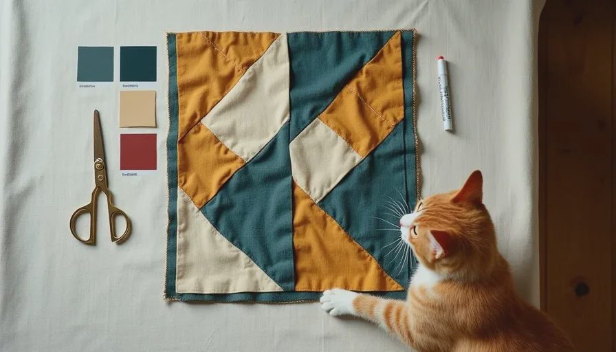
Three years ago, at the Brooklyn Flea, I found a handmade patchwork quilt folded under a pile of old curtains at a stall I almost skipped. I unfolded it, saw the colors, and felt something click. The quilt was made from dozens of fabric scraps — probably by someone's grandmother, probably decades ago — and its palette was unmistakable. Deep teal-blue cotton pieces alternated with warm cream squares, with tiny triangles of mustard yellow scattered throughout like punctuation marks. There were also a few strips of faded brick red, barely noticeable but essential — they were the secret ingredient that made the whole thing feel warm instead of cold.
I didn't know it yet, but that quilt was my entire living room. I brought it home for $25, draped it over the back of the sofa, and spent the next six months pulling colors from it. The deep teal became the wall color. The warm cream became the sofa upholstery and the linen curtains. The mustard yellow became two velvet cushions, a thrifted ceramic table lamp, and a small bowl that holds our keys by the door. The brick red — that tiny, almost-hidden accent within the accent — showed up in a single vase and the spine of a vintage book on the coffee table. Every color in my living room traces back to that one quilt. The room feels cohesive not because I'm a genius color theorist, but because the quilt already did the work. I just paid attention.
Example 2: The Thrifted Bowl

For our kitchen, I wanted a palette that felt different from the living room — warmer, earthier, more grounded in food and cooking and the colors of things that grow. The object I chose was a hand-thrown ceramic bowl I found at a secondhand shop for $8. It's glazed in a gradient that shifts from deep mustard yellow at the rim to a rich, rusty iron-red at the base, with patches of raw clay showing through where the glaze stopped. It's not a perfect bowl. It's slightly asymmetrical, and there's a small crack in the glaze near the bottom. That's why I love it.
From this bowl, I pulled three colors: the mustard-gold of the upper glaze (dominant, because it was the most cheerful and I wanted the kitchen to feel warm even on gray days), the rust-red of the lower glaze (support, for textiles and accents), and the raw clay brown of the unglazed base (accent, for small touches). The kitchen walls stayed white — it's a rental, and the white subway tile is part of the architecture — but the textiles, the dish towels, the rug in front of the sink, the ceramic canisters, and even the small painting I hung above the coffee station all trace back to that $8 bowl. When you walk into the kitchen, you don't see the bowl and think "this is the color source." You just feel that the room belongs together. That's the goal.
Example 3: Cleo's Cat Painting
This is my favorite example because it's the one that most surprised me. Cleo, when she was about six, painted a watercolor portrait of Gouache. The cat in the painting is orange — a bright, saturated, joyful orange that bears only a passing resemblance to Gouache's actual ginger tabby coloring. The background is a wash of pale blue-green that she mixed herself from a paint set. There's a patch of unpainted paper that reads as warm white, and a few splatters of a darker teal where she got enthusiastic with the brush.
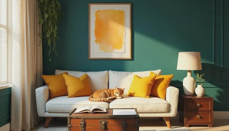
I framed this painting — thrifted brass frame, $5 — and hung it on the living room wall next to the big abstract piece. And then I realized, looking at it one afternoon, that Cleo had accidentally painted the exact palette of our living room. The pale blue-green wash was my wall color before I'd even chosen it. The warm white of the paper was my sofa. The orange cat was the mustard and rust accents. She'd absorbed the palette of the room — the quilt, the walls, the cushions — and reproduced it in her own work without anyone telling her to. That's the power of building a palette from things you actually live with. It seeps in. It becomes the visual language of your home.
How to Apply This in Your Own Space
If you want to build a color palette from one thing in your own home, here's the practical sequence I recommend:
Step 1: Choose Your Object
Walk around your home. Open your closets. Look at your shelves. Find something that makes you feel good when you look at it. Don't overthink this. Don't choose something because it's "designery" or because you think it should be your color source. Choose the thing you genuinely love. It could be a quilt, a ceramic mug, a book cover, a postcard, a scarf, a cushion, a painting, a photograph, a piece of clothing. The only requirement is that it has at least three distinct colors you can name.
Step 2: Name the Three Colors
Look at your object and identify the three most prominent colors. Not "teal" — that's too vague. Be specific. "Deep dusty blue-green, like the ocean on a cloudy day." "Warm cream, like the foam on a latte." "Mustard yellow, like a vintage taxi." The more specific you are, the easier it will be to match these colors when you're shopping for paint or fabric or cushions. Write the colors down. Take a photo of the object with your phone. Bring the object or the photo with you when you go to the paint store. Do not trust your memory. Memory lies about color.
Step 3: Assign the Roles
Decide which color will be dominant, which will support, and which will accent. The dominant color is the one that takes up the most visual space — usually walls, but in a rental where you can't paint, it could be a large sofa or a rug. The support color is the quiet workhorse that backs up the dominant without competing. The accent is the small surprise. If you're unsure, try the squint test: squint at your object until the details blur. The color you see most is your dominant. The second-most is your support. The smallest pop is your accent.
Step 4: Apply the 60-30-10 Proportion
Now take those three colors into your room. Aim for roughly 60% dominant, 30% support, 10% accent. Paint the walls the dominant color. Choose a sofa or rug in the support color. Scatter the accent color in cushions, lamps, small objects. Don't measure it exactly — this isn't math, it's a feeling. But if you walk into the room and one color is screaming at you, you've probably given an accent too much real estate. Scale it back.
Step 5: Let the Room Evolve
The palette is a starting point, not a prison. Over time, your room will accumulate other colors — a gift from a friend, a new plant, a book with a bright spine, a drawing your kid tapes to the wall. That's good. That's life. The palette gives the room a backbone, so when new things enter, they don't throw everything into chaos. They add layers. My living room palette came from a quilt, but it now includes the brick red of a thrifted vase, the green of the rubber tree, the pale blue of a postcard, the orange of the actual cat. None of those things were in the original plan, but they all work because the core three-color structure is strong enough to absorb them.
What If You Don't Have "The Object" Yet?
Some people tell me they don't own anything colorful enough to build a palette from. Their homes are full of neutrals, hand-me-downs, things they bought because they were practical. I understand this. I've been there — the beige period, the years when everything I owned was either gray or brown because I was afraid of making a mistake. Here's what I suggest: go thrifting. Not for furniture. Not for anything big. Go to a flea market or a thrift store and find one small, cheap, colorful object that makes you smile. A ceramic mug. A vintage scarf. A postcard. A piece of fabric. Spend $5 or less. Take it home. Look at it for a week. If it still makes you smile, build your palette from it. If it doesn't, you're out $5 and you've learned something about what you don't like, which is also valuable information.
The goal is not to find the perfect object. The goal is to find an object that already exists in the world — already made, already loved, already someone's — that already contains a color story you want to live inside. You don't have to invent the palette. You just have to notice it. That's what artists do. That's what decorators do, whether they admit it or not. They find something that already works and they borrow the logic. Taste isn't about creating from scratch. It's about paying attention to what's already beautiful, and bringing it home. Taste is free. Everything else, we thrift — including our color palettes.


Letters
No letters yet — be the first to write.