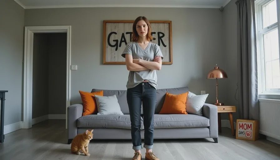
I try to be diplomatic about other people's homes. When a friend shows me their new apartment and they're genuinely excited about something I privately think is a design crime, I usually say something like "It's so you!" and change the subject to the light fixtures. But this blog is not a dinner party, and I am not here to be diplomatic. I am here to give you honest home design advice, which sometimes means saying the thing nobody in a sponsored post will say: some decor trends are bad. Not "not my style" bad — genuinely, objectively, what-were-we-all-thinking bad. They're trends that were invented by house flippers and big-box retailers, amplified by Instagram, and inflicted on millions of homes that deserved better. Here are five I refuse to apologize for hating, and what I recommend doing instead — which, as always, costs less and looks more like you.
Trend #1: Grey Vinyl Flooring (The Flipper Special)
If I walk into one more apartment with grey-washed vinyl plank flooring, I am going to lie down on that cold, shiny, unforgiving surface and refuse to get up. Grey vinyl flooring is the official floor of house flippers, budget landlords, and anyone who has ever said "we want it to look modern" while meaning "we want it to look like every other apartment listed on Zillow between 2017 and 2022."
The problem with grey vinyl isn't just that it's soulless — it's that it's impractical in ways that real wood isn't. Vinyl shows every speck of dust, every crumb, every cat hair. It scratches, and those scratches catch the light and create visible scars that can't be sanded out. When liquid spills on it — and in a home with kids, liquid spills on it approximately every seventeen minutes — the liquid just sits there, pooling in a reflective puddle, slowly seeping into the seams between planks. Those seams, by the way, are impossible to clean thoroughly. I've watched apple juice disappear into the gaps of a friend's vinyl floor, never to be seen again but definitely still there, fermenting quietly into a science experiment.
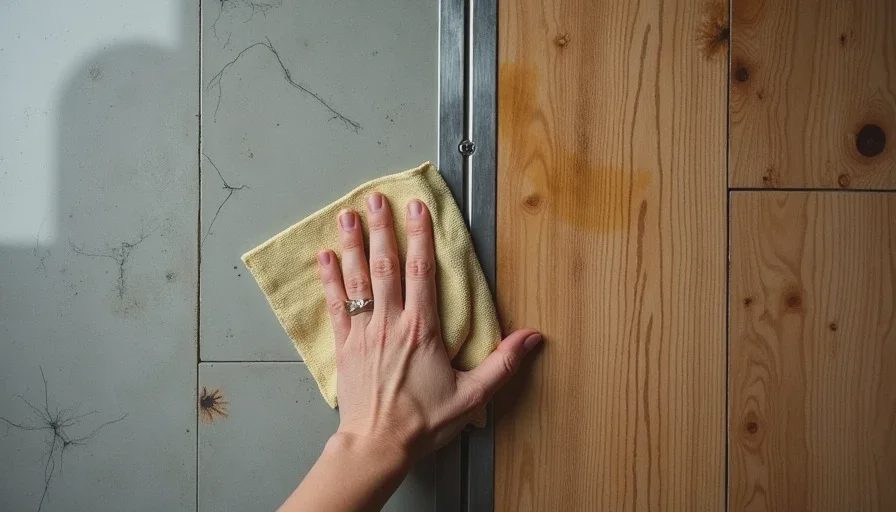
Real wood floors, on the other hand, absorb life. They stain. They scratch. They develop a patina that tells the story of the people who walked on them. Our Fort Greene apartment has original oak floors that are probably eighty years old. They have water marks, scuff marks, a dark spot where a potted plant leaked, and a gouge near the door from when Marcus dropped a bookshelf during our first move. They're gorgeous — not despite those marks, but because of them. If you have vinyl floors and you can't replace them, cover them with rugs. Big ones. Vintage ones. Rugs with color and pattern and stories. Just don't pretend the grey vinyl was a choice. It wasn't. It was the absence of a choice, and your home deserves better.
Trend #2: Word Art (GATHER. EAT. LIVE. LAUGH. PLEASE STOP.)
There is a piece of mass-produced wooden word art hanging in a suburban living room right now that says "GATHER." It was purchased at a big-box home goods store for $39.99. It was made in a factory that also produces signs that say "EAT" and "FAMILY" and "BLESSED." The typography is a faux-handwritten script that looks like someone's aunt's idea of a wedding invitation. And every time I see one of these signs, I want to ask: who is this sign for? Are your guests unsure whether to gather? Do they need a wall-mounted verb to know what to do in a living room?
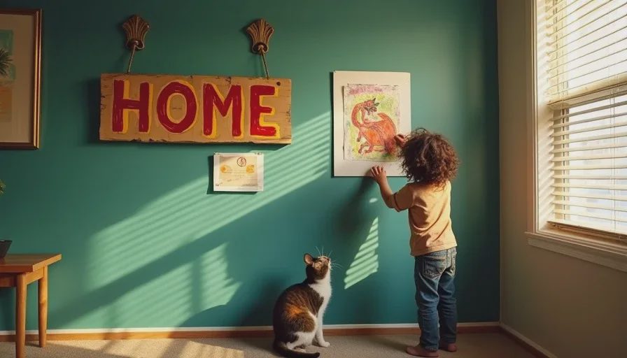
The word art trend is the result of a fundamental misunderstanding of what makes a home feel personal. A mass-produced sign that says "HOME" does not make your home feel like home. It makes your home feel like a home goods store. The sign is telling you what the room is supposed to be, rather than the room telling you what it is. A living room with a "GATHER" sign but no comfortable seating, no personal art, and no evidence that anyone has ever gathered there is just a room with a command on the wall.
The alternative is so simple it hurts: fill your walls with things that actually mean something. Your kid's watercolor painting of the cat. A postcard from your best friend. A Polaroid of you and your partner before the kids were born, looking impossibly well-rested. A small painting you found at a flea market for $8 that someone painted in 1973. A handwritten recipe from your grandmother, framed. A piece of fabric you love, stretched over a canvas stretcher. None of these things need to tell you to GATHER. They already gathered meaning just by being in your life.
Trend #3: The All-Grey Everything Palette
Grey walls. Grey sofa. Grey rug. Grey cushions. Grey curtains. Grey faux-wood flooring. The all-grey room looks like someone drained the life out of a photograph and called it design. I understand the impulse behind grey — it feels safe, it feels "sophisticated," it doesn't clash with anything because it has no personality to clash with — but a room without color is a room without emotion. It's a waiting room. It's a rental car. It's a bowl of plain oatmeal in interior design form.
The worst part is that grey is marketed as a neutral, but grey is not neutral. Grey has undertones — blue, green, purple, brown — and when you fill a room with five different greys that all have different undertones, the result is not "coordinated." It's a visual discord that your eye registers even if your brain can't name it. The sofa is a blue-grey. The walls are a green-grey. The rug is a brown-grey. They are all technically grey, and they are all fighting each other.
If you're afraid of color, start with something that isn't grey but also isn't terrifying. Warm cream. Soft ochre. Dusty rose. Pale sage. A color that has some life in it. A color that changes with the light. A color that makes your skin look alive instead of like you're standing under fluorescent bulbs in a basement. You don't have to paint your walls bright orange. You just have to choose something that didn't come from the "greige" section of the paint deck. I've written entire posts about how to build a color palette from one thing and why beige is the pumpkin spice latte of decor, so I won't repeat myself here. I'll just say this: grey is not a personality. It's a concession. And you deserve walls with an opinion.
Trend #4: Faux Everything (Faux Barn Doors, Faux Shiplap, Faux Distressed Furniture)
I understand why people buy faux versions of expensive materials. Real marble is thousands of dollars. Real exposed brick is an architectural feature you either have or you don't. Reclaimed barn wood is — surprise — not readily available to people who live in Brooklyn apartments. But there's a difference between "I can't afford the real thing so I'll find a creative alternative" and "I'm going to cover my wall in plastic panels printed with a photograph of shiplap." One is problem-solving. The other is a lie you're telling your drywall.
The faux barn door is the worst offender. A real sliding barn door is heavy, solid wood, mounted on a substantial iron track, and it serves a purpose — closing off a large opening in a space where a swinging door would be impractical. A faux barn door from a big-box store is a hollow-core interior door with a plastic laminate that looks vaguely like wood grain, mounted on a decorative track that cost $200. It doesn't close properly. It doesn't block sound. It doesn't even look like a real barn door — it looks like a door dressed up as a barn door for Halloween. Every time I see one, I think about the perfectly functional door that was removed to install it, probably sitting in a landfill somewhere, while this plastic impostor slides ineffectually across a bathroom entrance.
The same goes for faux-distressed furniture. If a piece of furniture is genuinely old and genuinely worn, the wear tells a story. The water ring from someone's coffee cup. The scratch from a move across the country. The faded spot where sunlight hit the same corner for forty years. That's beautiful. That's patina. A new piece of furniture that's been sanded in random spots by a machine in a factory to look "vintage" isn't patina. It's a costume. Skip the faux-distressed dresser at the big-box store and go find a real old dresser at a flea market. It'll cost less, it's made of actual wood, and its scratches actually mean something.
Trend #5: The Tufted Everything Overload
Tufted headboards. Tufted ottomans. Tufted sofas. Tufted dining chairs. Tufted bed frames with matching tufted benches that nobody ever sits on. The tufted furniture trend is the design equivalent of a shirt with too many buttons — technically functional, aesthetically overwhelming, and deeply uncomfortable to actually use.
Here's the problem with tufted furniture that nobody in the showroom mentions: the tufts collect dust. Every single button creates a little crater, and every crater is a dust trap. If you have a tufted headboard, you are sleeping underneath a dust collection system. The deep crevices around the buttons also trap crumbs, pet hair, and — if you have children — substances I cannot name in polite company. Cleaning a tufted surface is not wiping. It's archaeological excavation.
And then there's the comfort issue. Tufted furniture is almost always upholstered in velvet or a velvet-like fabric, because the tufting needs a plush surface to look properly dramatic. Which means you're combining the dust-trap problem with the impossible-to-clean problem I've already written about in my upholstery post. A velvet tufted dining chair — and I've seen these in real people's homes — is a piece of furniture designed to be photographed, not sat upon. You cannot eat spaghetti on a velvet tufted dining chair. You cannot have a toddler on a velvet tufted dining chair. You can barely exist on a velvet tufted dining chair without leaving behind evidence of your existence in the form of lint, crumbs, and regret.
The alternative: smooth upholstery. Flat surfaces. Furniture that's designed to be used, not admired from across the room. A simple wooden headboard — or no headboard at all, just a wall in a color you love. An ottoman that's actually comfortable to put your feet on. Dining chairs that can survive spaghetti night. Your home is not a hotel lobby. You don't need furniture that announces itself. You need furniture that works.
The Common Thread
Looking at this list — grey vinyl, word art, all-grey palettes, faux finishes, tufted everything — I can see what connects them. These are trends designed to make a home look like it was decorated by someone who knew what they were doing, without requiring the homeowner to actually know what they're doing. They're shortcuts. Training wheels. A formula you can buy off the shelf and install in a weekend. The problem is that a formulaic home doesn't feel like anyone lives there. It feels like a staging. It feels temporary. It feels like the before photo in a renovation show, even when it's the after.
Realistic family home decorating — the kind that actually makes you happy when you walk in the door — is slower. It's messier. It's full of things that don't match but still belong together, because they all belong to you. It's floors that show their age and walls covered in kid art and furniture that's been repaired rather than replaced. It's a room that looks like a life is being lived in it, because a life is being lived in it. Trends come and go. Grey vinyl will look as dated in ten years as avocado refrigerators look now. But a home that feels like you — that never goes out of style.

Letters
No letters yet — be the first to write.