The first time I painted a front door, I chose a color called “historic red” because the tiny paper swatch looked charming. On the actual door, it looked like a fire alarm. That mistake taught me two things: paint changes dramatically outdoors, and front door color meanings are useful only when they support the house, the street, and the people walking through it. You do not need a designer or a $900 gallon of designer paint. You need a sample pot, a little nerve, and five minutes in daylight.
Why front door color meanings still matter
A front door is a small surface with an outsized job. It greets guests, frames the entry, and tells delivery drivers they have found the right address. Color symbolism gives that decision a helpful starting point, but it is not a rulebook. Red can suggest warmth, energy, or welcome. Blue often feels calm and dependable. Green can connect a home to gardens, trees, or older architectural traditions. Black can look formal and grounded, while yellow brings cheerful energy that is either delightful or aggressively sunny depending on the house.
The most useful front door color meanings are the ones that match your actual life. If your entry is dark, a deep charcoal door might feel elegant in a photo and gloomy at 7 p.m. If children are constantly dragging muddy scooters past it, bright white is less a style choice than a part-time cleaning job. I like symbolism, but I like not scrubbing fingerprints more.
Before buying paint, look at the fixed colors you cannot easily change: brick, stone, siding, roof shingles, porch railings, and metal hardware. Hold sample cards vertically against the door in morning, afternoon, and evening light. A color that works beside warm red brick may look strange against cool gray siding. This is where most expensive-looking mistakes begin: not with bad taste, but with judging color from a two-inch card under a store’s fluorescent lights.
Red, blue, and green doors in real homes
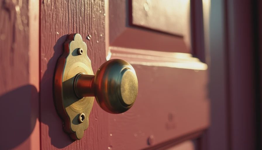
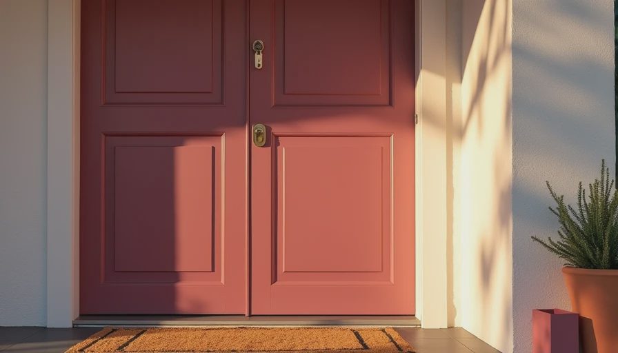
Red is the classic attention-getter. Traditional front door color meanings connect red with hospitality, vitality, and a confident welcome. On a narrow row house, a painted red door can make the entrance feel intentional rather than squeezed between two walls. I would choose a softened brick red, oxblood, or cranberry before a bright primary red. They still have presence without making the facade look like a holiday decoration in July.
Blue is easier to live with than many people expect. Navy gives a modest porch structure, while dusty blue feels relaxed and works beautifully with white trim. Blue front door color meanings usually lean toward calm, trust, and steadiness, which explains why the color appears so often on traditional homes. My own favorite is a slightly gray blue that looks quiet on cloudy days and surprisingly rich in sun. Avoid testing only one blue; undertones range from inky violet to pool-water turquoise.
Green can be earthy, historic, or unexpectedly modern. Forest green suits brick and natural stone, sage works with warm neutrals, and olive can make a plain beige exterior look considered without shouting. Green door symbolism often suggests renewal and connection to nature, but the practical advantage is just as good: many green shades hide dust better than pale colors. That matters if your front steps open directly onto a busy sidewalk.
Black, yellow, white, and unexpected choices
Black is not automatically severe. On a Victorian, brownstone, or simple white cottage, a black door can create a crisp anchor. The front door color meanings here tend to involve sophistication, strength, and formality. The catch is heat. A south-facing metal door painted nearly black can become very hot, and some materials or manufacturers limit which dark colors are appropriate. Ask the paint store about the surface before committing.
Yellow is friendly in theory and difficult in practice. The right buttery yellow can make a shaded entry feel alive. The wrong lemon yellow can look like a preschool wall. Use a sample at least two feet wide and view it from the sidewalk, not with your nose pressed against the door. White offers a clean, classic look, but it shows pollen, scuffs, and every hand that missed the knob. If you want white, choose a durable satin or semigloss exterior product and accept that touch-ups will be part of the bargain.
Orange, purple, and teal are not forbidden; they simply need architectural backup. A muted teal can be terrific on a neutral facade, especially with brass hardware. Plum works better on a dark, traditional exterior than on pale vinyl siding. Orange is best when it is terracotta or burnt pumpkin rather than traffic-cone bright. The strongest front door color meanings come from the complete combination, not the paint color alone: trim, porch light, house numbers, plants, and hardware all join the conversation.
How to choose a color without wasting money
Start with three sample pots, not twelve. I usually buy one safe option, one color I genuinely want, and one bridge color between them. A $12 to $25 sampling mistake is cheaper than repainting a door, and far cheaper than living with a color you resent for three years. Clean the surface, lightly sand peeling areas, and use a suitable primer where the old color is strong or uneven. Skipping prep is how a promising Saturday becomes a peeling mess by fall.
Paint the samples in separate vertical rectangles, leaving space between them. Check them from the curb, from inside the house, and under the porch light. If the door receives full sun, watch for glare. If it sits beneath a covered stoop, check the color on an overcast day. Satin is generally forgiving and easier to wipe than flat paint; semigloss gives more shine but highlights dents and brush marks. Two thin coats usually look better than one heavy coat, even when the label promises excellent coverage.
Hardware can change the whole result. Brass warms navy, green, and red. Black hardware sharpens pale blue and yellow. Nickel feels cooler and more contemporary. You do not need to replace every hinge and house number. I once revived a tired entry with a $28 quart of paint, a $9 brass spray-paint touch-up, and a new doormat found for $14 at a neighborhood sale. The door looked finished because the small details stopped competing.
Match the mood to the architecture
A modern facade can handle saturated teal, deep blue, or almost-black paint. A craftsman often welcomes forest green, warm red, or ochre. A brick row house usually benefits from a color that respects the brick’s undertone rather than trying to match it exactly. For a rental, removable accents such as a new doormat, planter, or seasonal wreath can create the same welcome without risking a lease issue.
Front door color meanings become less important when the color fights the building. A pale lavender door may be beautiful, but if the exterior is tan brick with orange mortar, it can appear disconnected. On the other hand, a restrained house with one unexpected door color can feel personal instead of generic. I would rather see a small, deliberate surprise than another black door chosen because every listing photo has one.
My practical front door color verdict
Choose the color you will enjoy seeing while carrying groceries, not the shade that earns the most compliments online. Test it outside, account for the fixed materials, and spend your money on preparation before premium branding. If you love red, use red. If blue feels like you, do not talk yourself into beige because it seems safer. The best front door color meanings are the ones visitors feel without needing to explain: welcome, confidence, and a home cared for by actual people.
My current favorite is a smoky blue-green with warm brass hardware. It photographs well, hides ordinary city dust, and has survived three years of rain, soccer balls, and Gouache the cat clawing at the screen beside it. That is a stronger recommendation than a trend report. Taste is free. Everything else, we thrift.


Letters
No letters yet — be the first to write.