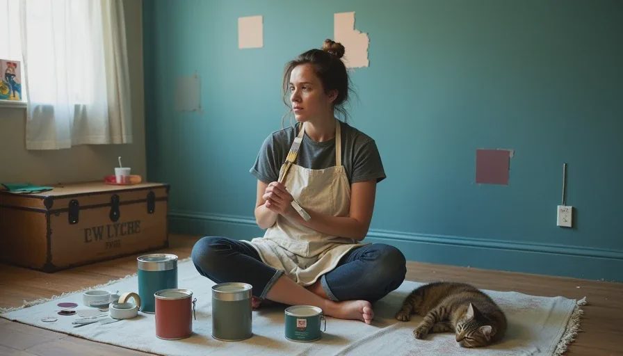
I have painted more walls the wrong color than most people have painted walls, period. This is not a brag. It's a confession, delivered from the floor of my living room while surrounded by the graveyard of sample pots you see in the photo above. If you've ever stood in the paint aisle paralyzed by a wall of three thousand color chips, wondering how anyone makes a decision without a degree in color theory — I see you. I am you. The difference is that I've now made enough paint color mistakes to fill a support group, and I'm going to tell you about the three worst ones so you can skip directly to the part where your walls look good. This is honest home design advice from someone who has cried actual tears over undertones. Let's begin.
Mistake #1: The White That Wasn't White
This was in our second Brooklyn apartment, a one-bedroom in Crown Heights with beautiful south-facing windows and a landlord who said we could paint as long as we "kept it neutral." I wanted a warm white living room — something gallery-like but not sterile, the kind of white that makes art pop and morning light feel like a blessing. I went to the hardware store, stared at the white section (there are approximately four hundred whites, none of which look like each other), and chose a chip called "Swiss Coffee." The chip looked creamy and soft. I bought two gallons without testing it first. This was my first mistake, and the one that seeded all the others.
I painted the entire living room over a weekend. It looked fine while it was wet. It looked fine on Sunday evening under artificial light. On Monday morning, when the sun hit the walls, my living room was mint green. Not aggressively green — not "someone painted this room green" green — but a subtle, sickly, institutional green-white that made the whole space feel like a dental office in a country with socialized medicine. The undertone, which had been invisible on the chip and under the hardware store's fluorescent lights, was a cool green-gray that our southern light pulled out with brutal efficiency.
I lived with the mint-green living room for eight months because I was too stubborn and too broke to repaint immediately. Every morning, I woke up and felt vaguely like I should be filling out paperwork. When we moved out, the landlord asked if we'd painted the living room green. "It was supposed to be white," I said. He nodded slowly, the way you nod at someone who has just told you they tried to cut their own hair.
What I Learned About Undertones
White paint is the hardest color to get right because white is never just white. Every white has an undertone — blue, green, pink, yellow, gray — and that undertone will reveal itself the moment your specific light hits it. Northern light is cool and will amplify warm undertones. Southern light is warm and will pull out cool undertones — which is exactly what happened with my mint-green disaster. The fix, which I now practice religiously, is to buy sample pots of at least three whites, paint them on large poster boards (not directly on the wall, because you need to be able to move them around), and look at them in every light condition for at least three days. Morning light. Afternoon light. Lamp light. The white that looks perfect at noon might look like a hospital at dusk. Also, hold the sample next to something that is actually white — a sheet of printer paper, a pure white tile — because your eye will adjust to whatever is on the wall and stop registering the undertone. The contrast of a true white next to your sample will expose every hidden green or pink.
Mistake #2: The Feature Wall That Nearly Ended My Marriage
This was in the same Crown Heights apartment. After the mint-white debacle, I decided the bedroom needed "drama." I had recently seen a design magazine featuring a bedroom with one wall painted in a deep, moody charcoal, and it looked sophisticated and cocooning and very adult. I chose a color called "Iron Mountain" — a dark, cool charcoal with blue undertones. I painted the wall behind our bed. One wall. How bad could one wall be?
It was so bad. The bedroom had one window, facing north, which meant the light was already cool and dim. The charcoal wall absorbed every photon that entered the room. The bed, which was pushed against that wall, seemed to recede into a void. Marcus, who is a software engineer and not prone to dramatic statements about decor, walked into the bedroom on the evening I finished painting and said, "It feels like the wall is staring at me." He was right. The wall had a presence. It loomed. We slept in that room for three months, and every night I felt like I was sleeping with my back to a cliff face.
The final straw came when I tried to photograph a small painting I'd done for a client. I set up the painting on the dresser opposite the charcoal wall, and the dark wall sucked so much light out of the room that the painting — which was full of bright, warm colors — looked muddy and flat. I was sabotaging my own work with my paint choices. I repainted the wall the following weekend, this time in a warm, dusty mauve that glowed in the low light. Marcus helped. We didn't speak much during the process, but when it was done, he said, "It feels like a bedroom again." That was the most romantic thing he'd said to me in months.
What I Learned About Dark Colors in Small Spaces
Dark walls do not automatically make a room feel small. Badly lit dark walls make a room feel small. If you're going to go dark — and I still love dark walls, as evidenced by my current deep teal living room — you need to understand two things. First, the light in the room needs to be able to hold its own against the darkness. A room with one north-facing window is not the place for a charcoal feature wall. Second, dark colors in windowless or low-light spaces will read as black, not as the rich complex color you saw on the chip. In the hallway disaster I'll describe in a future post, a deep blue-green read as pure black in the unlit end of the corridor. If your space lacks natural light, either commit to adding artificial light that's warm and layered — multiple sources, not one overhead bulb — or choose a mid-tone instead of a true dark.
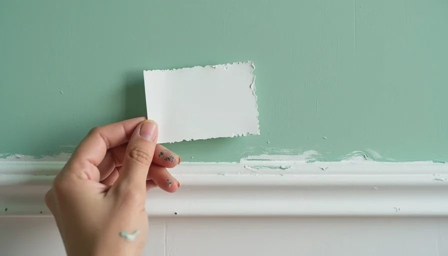
Mistake #3: The Accent Ceiling That Made Everyone Look Ill
This is the most recent mistake, and it happened in our current Fort Greene apartment about three years ago. I had this idea — and I still don't know where it came from — that painting the kitchen ceiling a pale butter yellow would create a "sunny, cheerful glow" that would compensate for the kitchen's lack of direct sunlight. The kitchen is small, galley-style, with one small window that faces an air shaft. It needs help in the light department. I thought a yellow ceiling would be the help.
What I failed to consider is that light bounces. Specifically, light bounces off the ceiling and onto everything below it — including faces. A pale butter yellow ceiling does not create a sunny glow. It creates a situation where everyone standing in your kitchen looks like they are in the early stages of jaundice. Marcus noticed it first. "Do I look sick to you?" he asked, standing by the stove. He did. He looked slightly yellow. I looked slightly yellow. The twins, who were about five at the time, looked slightly yellow. The only creature in the household who looked normal was Gouache, because he is orange and the yellow bounce light just made him look more orange, which is his natural state.
I repainted the ceiling white — a proper white, which I tested extensively — two weeks later. The whole experiment cost me about $60 in paint and primer and one dinner party where three separate guests asked if the kitchen lighting was "vintage." It was not vintage. It was a mistake.
What I Learned About Ceilings and Light
Ceilings are not accent walls. They are the largest uninterrupted surface in a room, and the color you put on them will affect every other color and every person in that room. If you want to paint your ceiling something other than white — and I'm not saying you shouldn't — test it more rigorously than you would test a wall color. Paint a large sample on a board, hold it horizontally above your head in the actual room, and look at what it does to the light and to the skin tones of anyone standing near you. Better yet, take a selfie under it. If you look even slightly off-color, scrap the idea. A colored ceiling can be magical in a room with twelve-foot ceilings and abundant natural light. In a galley kitchen with an air-shaft window, it's a medical simulation.
What All Three Mistakes Have in Common
Looking back at these disasters — the mint-white, the looming charcoal wall, the jaundice ceiling — I can see a pattern. In every case, I made a decision based on how I wanted the room to feel, without accounting for how the room actually behaved. I wanted the white to feel warm and gallery-like, but I didn't account for the southern light pulling out green undertones. I wanted the charcoal to feel dramatic and cocooning, but I didn't account for the weak northern light. I wanted the yellow to feel sunny, but I didn't account for the fact that light bounces and skin tones exist.
The paint color guide for rooms advice I now live by is this: test everything in the actual space, in the actual light, for multiple days, and involve the people who actually live there. Marcus's "it feels like the wall is staring at me" was more useful feedback than any design magazine. The kids' silence on the yellow ceiling (they didn't mention it, which meant it wasn't making them happy) was more telling than my own optimism. And the mint-white living room — which I lived with for eight long months — taught me that a bad paint color won't ruin your life, but it will make every morning feel slightly off, and life is too short to feel slightly off in your own home.
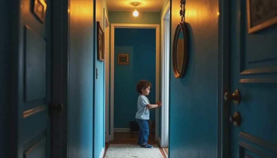
The Rule I Now Follow
If I'm trying a new color — especially a white or a dark — I buy the sample pot. I paint it on a large piece of poster board (at least 2 feet by 2 feet, because a tiny swatch tells you nothing). I move that board around the room for a minimum of three days. I look at it in morning light, afternoon light, and lamp light. I hold it next to the floor, next to the trim, next to the sofa. I ask Marcus what he thinks. I ask the kids what color they see (children are brutally honest about color — if Felix says "it looks like a frog," I know I've got a green undertone problem). And only then, after all of that, do I buy the gallon. It's a slow process. It's not Instagram-friendly. But it's the only thing that's kept me from adding a fourth disaster to this list.



Letters
No letters yet — be the first to write.